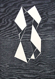
Considering the fact that concept has always been one of my biggest struggles starting a project, Patrick gave us another option for a design process. We took a mini field trip over to the Weatherspoon Art Museum beside our studio building, and looked through a specific gallery. Patrick had us stand by a painting that we felt an especially close affinity to, that we would use for our next project. I chose "High Up" by Josef Albers. I was originally drawn to the strong, simplistic geometric shapes. What i've noticed about my design style is that it has developed into a very linear style, with clean lines and no curves. The other pieces in the gallery were abstract in nature and had many brush strokes that suggested at curves.

Josef Albers
High Up, 1948
Woodcut
Image size: 8 x 9 1/2 inches
(20.3 x 24.1 cm)
Paper size: 11 x 15 1/2 inches
(27.9 x 39.4 cm)
Signed and dated “Albers 48” l.r. titled and numbered l.l.
Edition of 10, 2 known proofs
(Inventory #16123)
I started researching Josef Albers as an artist after our trip, and found that he loves tricking the mind. He deals quite heavily with illusions and positive negative space. He draws a certain kind of interest that forces the viewer to think about the lines and how they are all connected. Each painting, drawing, and sketch can be created without lifting the utensil.


No comments:
Post a Comment